What makes Yellow-Red-Blue such a perfect exemplar of Wassily Kandinsky’s special color theory?
- Joy in a yellow bottle
- A heroic blue marble
- The transitional magic of messy red
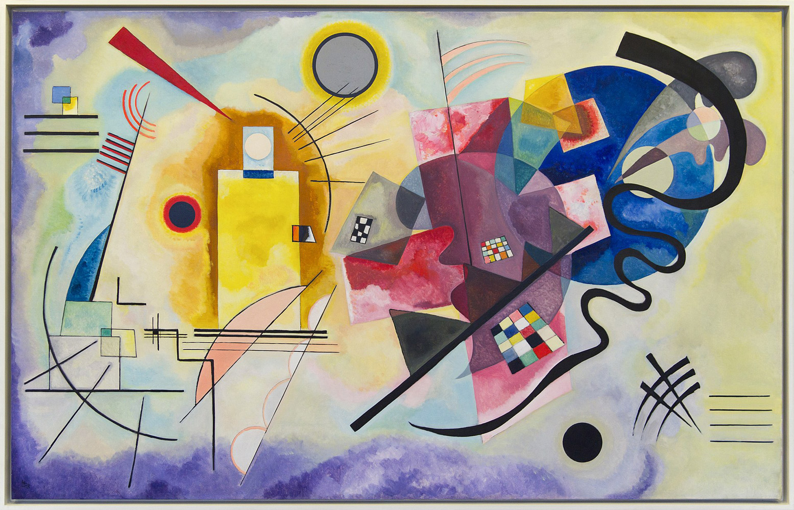
I love Yellow-Red-Blue from 1925 because it’s such a joyful Kandinsky. The colors explode across each side of the canvas. In fact, it almost feels like two paintings. There’s a brilliant box of sunshine to our left. While a bountiful trumpet of pinks, purples and blues blows into the sky on our right. When he painted this, Kandinsky was also teaching painting and color theory. He combined these subjects with elements of form psychology. That means he composed emotional orchestrations out of colorful shapes.
We all know the color yellow and what a square is. These are familiar visual fundamentals. The simplicity of color and shape combine to resonate complex feelings. After all, boxes and lines are basic. But human emotions snowball with complications. That’s why Yellow-Red-Blue feels elaborate and emotive, though it’s only colors and lines.
The side on our left glows bright and boxy. It feels clean, direct, and fresh. This left side lines up with clear verticality. Whenever I look at this piece I see a bottle of yellow liquid on the left. On the right side of this masterpiece Kandinsky painted more abstract and dark shapes. When I connect this wicked flourish on the right with the clean bottle on the left, I see a story. This story has a surreal, Alice in Wonderland vibe. A character drinks from the yellow bottle on our left and the results burst into the party on our right.
Kandinsky Color Theories
Luckily Kandinsky wrote with clarity about color and its meaning. In 1911, he published the book Concerning the Spiritual in Art. This writing explored his ideas about color’s effect on human emotions. Kandinsky explains that violets represent morbidity or sorrow. Notice that this painting rests in a purple cloud along the left side. The towering yellow bottle contrasts with this amorphous billowing lavender. They oppose each other in both color and form. Purple and yellow are opposite ends of the color spectrum. A cloud couldn’t be much more different from a sharp-edged rectangle.
Kandinsky’s yellow meant warmth and excitement. So I love how he seems to have bottled these feelings on the left side of Yellow-Red-Blue. Then, the yellow swirls around a grey sun and leaps across the twelve foot painting. It blooms on the far right. This creates a frame of purple and yellow around the shapes in the painting’s middle. Also, the color variance reinforces the theme of this as two paintings-in-one. That’s because they’re complementary colors. The left frame feels like a downer to Kandinsky. While the right side frame signals ebullience.
Blue was Kandinsky’s favorite color. He saw blues as cool and deep like the ocean or the supernatural. That’s where I get the Alice in Wonderland impression. This painting’s a trip across emotions and we’re carried there by a mysterious drink. The blue area evokes a glorious circle of wonder on our right. There’s also a red semi-circle beside the blue. But the red works more like a messy guidepost that directs our eye to that big blue orb. This transition makes sense given Kandinsky’s concept of red.
He sees reddish hues as seeking aspirations. So, red serves him as an escort in theory as well as in this painting. Even in the painting title, Red sits in the middle, like a transitional feature. The story flows through these colors like a drink flows through a character’s body. It starts with soft violet sadness. Then, with our eye traveling left-to-right, a bright yellow drink rises high to overtake the scene. That encapsulates the left side of the painting.
The right side conveys the liquid’s after effects. At first it’s a bit muddied and reddish. There’s a mix of colors and forms that lead our eyes straight to the big blue marble. It’s a glorious cobalt ball feels like the hero of this story. It carries our character out of sorrow and into a more celestial place. There’s peace and serenity rather than tears in Kandinsky’s blue. That gives Yellow-Red-Blue a happy ending. In fact, every time I see this masterpiece, it’s a joy.
Yellow-Red-Blue – FAQs
Where can I see Kandinsky’s Yellow-Red-Blue in person?
You can see the painting Yellow-Red-Blue by Wassily Kandinsky at the Musée National d’Art Moderne, Centre Georges Pompidou, Paris, France. It’s an overwhelming glory at about twelve feet wide. Best of all, it exerts jubilance. I can’t help but feel happy when I’m lucky enough to visit this masterpiece in person.
What do colors mean in Wassily Kandinsky’s special color theory?
The book Concerning the Spiritual in Art by Wassily Kandinsky outlines his color theories. He breaks down each color into emotions and musical instruments. For example:
Blue evokes coolness, and something deep, innermost, or supernatural. Linked with flutes for bright blues, and cellos and organs for darker blues.
Yellows read warm and thrilling. Associated with trumpets.
Green hues feel still and peaceful but with a resonant underlayer of strength. Associated with a soft violin sound.
White evokes a silence rich with possibilities.
Black is a hopeless abyss of silence.
Grey shades represent immovability or something unchanging.
Reds are vital and strive towards goals. Also associated with trumpets.
Brown represents dullness, hardness, and repression.
Orange hues are radiant, they feel healthy and bright. Associated with alto singers and mid-range church bells.
Violets represent sorrow; associated with the English horn and the bassoon.
Kandinsky’s 1925 painting Yellow-Red-Blue illustrates these color theories in vibrant action. It also includes a grey sun with a yellow frame around it. This perfectly reveals how the sun is always there for us, unchanging. While it also warms us with life-giving yellow light day after day.
Like this analysis of Yellow-Red-Blue?
Check out these other essays about the
work of abstract painters.
See Yellow-Red-Blue at The Museum of Modern Art, Pompidou
Wassily Kandinsky, M. T. Sadler (Translator), Adrian Glew (Editor). Concerning the Spiritual in Art. (New York: MFA Publications and London: Tate Publishing, 2001).
“Concerning the Spiritual in Art”. Guggenheim Internet Archives.
Lindsay, Kenneth; Vergo, Peter (1994). Kandinsky: Complete Writings on Art. New York: Da Capo Press.
Düchting, Hajo (2000). Wassily Kandinsky, 1866–1944: A Revolution in Painting. Taschen.
Sixten Ringbom, The sounding cosmos; a study in the spiritualism of Kandinsky and the genesis of abstract painting, Abo Akademi, 1970.
See Michael Paraskos, “English Expressionism,” MRes Thesis, University of Leeds, Leeds 1997
Spencer Frederick Gore, “The Allied Artists’ Exhibition at the Royal Albert Hall (London)”, in “The Art News,” 4 August 1910
Ulrike Becks-Malorny. Wassily Kandinsky 1866–1944: The Journey to Abstraction (Taschen, 2007).
Julian Lloyd Webber. “Seeing red, looking blue, feeling green”, The Daily Telegraph, 6 July 2006.